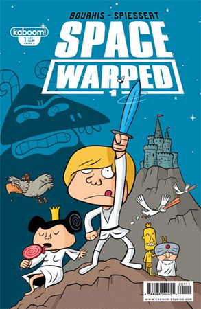
Issue: Space Warped #1
Release Date: June 8, 2011
Writer: Hervé Bourhis
Artists: Rudy Spiessert
Colors: Mathilda
Letters: Deron Bennett
Cover: Rudy Spiessert
Publisher: kaboom!
This funny little parody pleasantly surprised me with wittier humor and a more moving plotline than I was expecting. Overall, a fun read! No spoilers ahead, so you can read this before you read Space Warped.
KABOOM! released the cover and the premise of this originally-French comic months ago as a teaser. The line of kid-friendly comics is known to print graphic novels safe for kiddie eyes and still tickling to adult brains. And, well, Space Warped is totally one of those! The content itself is safe for young ones, but still made me legit LOL.
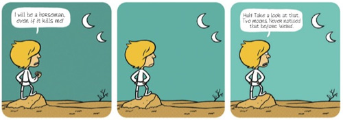
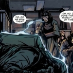
It was originally written in French and then translated and “Americanized,” so I think most readers are expecting cultural jokes and word play to be totally lost. The folks penning Space Warped were able to totally carry through on the humor, though. There were one-liners as well as humorous situations that genuinely got me to laugh.
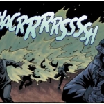
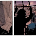
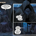
The artwork is so-so. The drawing style and color palette really aren’t my cup of tea. I usually prefer either bright and poppy or really genre. This style is kinda reminding me of Ren and Stimpy and other grungier cartoons. Well executed and done with talent, but just not an artistic style that fits easily on my eyes. In some of the earlier, more mono-chromatic scenes, my eyes were just glazing over. As the storyline traveled and new locations were introduced, the color picked up and I began to like the look of it more.
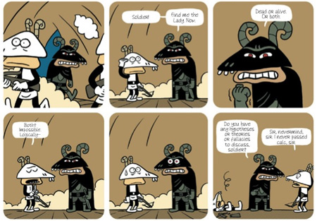
The storyline carried in a unexpected way, especially for such a close parody. When you’re seeing something play off such a known storyline, the reader goes in preemptively knowing what will happen. But, honestly, I found Space Warped surprising me and the scenes shifted in a light and fresh way. Still obviously Star Wars, but seen through a new lens.
The cleverness, wittiness, and skill of the writing is really making me smile. I’m looking forward to the next installation. Even if the artwork isn’t my favorite style, I still have an appreciation for its use with lending to the overall tone and grit of a uniquely developed children’s comic.


 Growing up, Rose Duggan had no idea she was a geek. She thought her childhood of space camp, anime, Tolkien, and sci-fi was totally normal. The blame should probably lean towards her parents: a couple of original Trekkies who own a small collectibles business.