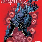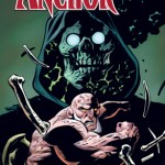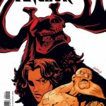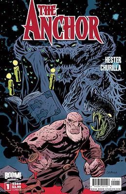
Issue: The Anchor #1
Release Date: October 15, 2009
Writer(s): Phil Hester
Artist(s): Brian Churilla
Cover(s): Brian Churilla, Dave Stewart, Rafael Albuquerque
Colors: Matthew Wilson
Letterer: Ed Dukeshire
Publisher: BOOM! Studios
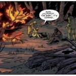
The Anchor lives a dual existence, half of himself in The Borderlands and the other half on Earth. His soul guards The Borderlands from those demons who try to escape Hell, while his body fulfills a similar function topside; only catch is, wounds inflicted to the soul manifest on the body. Don’t let his appearance fool you, he may be covered in scars (and in one case, he even burst into flames), but he can take a beating and give it back. After all, when you’re working for the Almighty, what’s a few cuts (or blood-gushing wounds) here and there?
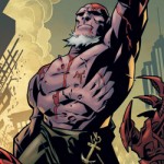
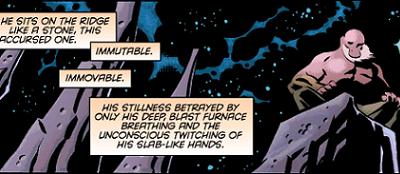
My first impression was “Huh, that kinda looks like a Hellboyish rip off” and, while you can find some similarities, I think you will find that The Anchor stands completely on his own two feet. Yes, they both fight demons, and they have huge, hulking physiques, but that is really where the comparisons end. After reading only the first page, I was completely hooked. It lures you in describing The Anchor as he sits guarding the gateway between Heaven and Hell; he is a figure wrapped in mystery. I find that if a comic doesn’t have me interested in the first couple of frames I’m more likely to put it down and never pick it back up again than to see if it hits its stride.
While I love the writing, which at times borders on lyrical prose, the art is my absolute favorite aspect of the first issue of The Anchor. I am a big fan of bold lines and rich color. The panels themselves lean towards the larger end of the spectrum, taking in broad sweeps of scene or action at a time. Again I have to go back to the first page — The Anchor sits there a pinkish red against the blacks and blues of the background. He is the focal point, and as he comes into focus and the narrative of who he is happens around him, you wonder even more about who this character is and you’re immediately pulled in.
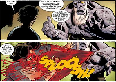
Overall, this was a strong first issue and a good introduction to the series. All of the supernatural beasties look amazing, I think if I had one thing that I didn’t care too much for was the human character designs. The nurse’s face, for example, when The Anchor goes into the hospital in Iceland, is boxy and almost a little cross-eyed in one panel (before she gets absolutely sprayed in blood — see earlier picture for reference). For folks like me who like a strong narrative, original storyline, and dark gritty comics, this looks like it is gearing up to be a crowd pleaser. The Anchor gets an easy 4 out of 5.


