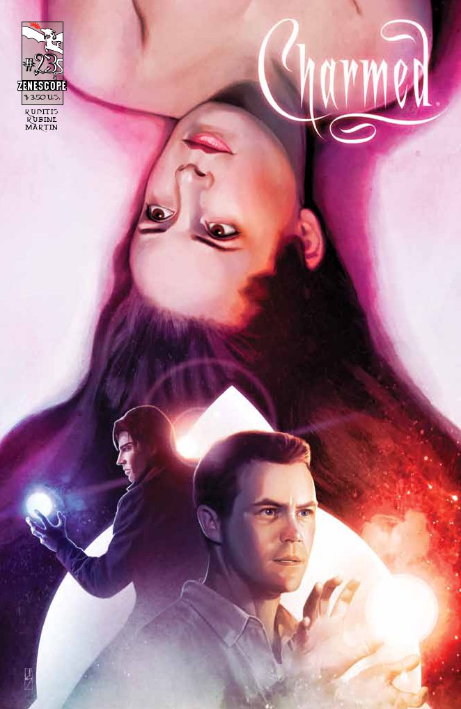
Issue: Charmed #23: “The Darklight Zone”
Release Date: August 2012
Author: Paul Ruditis
Artist: Rubine
Cover: David Seidman
Colors: Dash Martin
Letters: Jim Campbell
Editor: Matt Rogers and Hannah Gorfinkel
Publisher: Zenescope Entertainment
We have the reasons behind Rennek’s actions, we have explanations of how magic got turned upside down, and we have a plan…maybe. Looks like it’s once again up to the Charmed Ones to take on the battle to make the world safe. At least this time they have an army of help to aid them in their attack.
Considering how much time has passed from the release of the last issue to this one, I’m surprised that the storyline took a time jump, too. Prue has already filled in the sisters about Cole’s information, they’ve gotten their powers back, and now Paige, Phoebe, and Leo are out trying to track the contact down. Unfortunately, like many of the viable people in this fight, she’s dead. But don’t count her out just yet. Before she passed, she managed to infuse a part of herself in her mirror, so she is able to talk to the sisters and share the knowledge she has of the battle ahead. She also allows us a glimpse into Leo and Rennek’s past so we have a better understanding of who they are to one another.
I liked the retrospective, as well as the information we get on why Rennek’s doing all this. He’s tired of the fighting, the constant pull between good and evil, and wants it to end. That’s effectively what he’s done. With the use of Leo’s sword and Gimoire, he’s cut off the Elders and the Underworld, making Earth stand alone. However, in doing so, he also threw the balance of magic off. That’s why magical beings were without their powers and non-magical beings could suddenly use it.
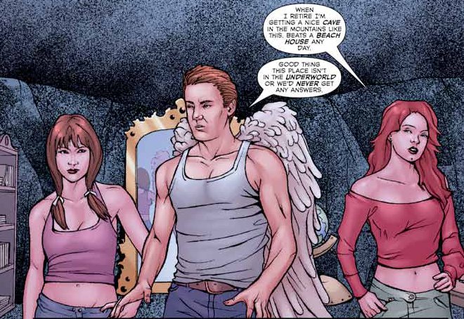
Before we switch over to the other half of the family, I wanted to make special mention of the artwork for this issue. I’m really not a fan of the drawings, nor the washed out color, in many of the panels. When we first see Paige, Phoebe, and Leo, they look like teenage models striking poses. This doesn’t let up throughout most of the issue either. I’m not sure the purpose of such stylings, but many times it distracted me from the storyline enough that I had to go back and re-read. It wasn’t a good choice, I don’t think, and I hope they correct it in future issues. Okay, enough of that rant, onward to the rest of the storyline.
While part of the family is getting the dirt on Rennek, Piper and Prue are learning a few things on their own. Piper is watching her sister target practice, but ultimately it’s about getting to the root of Prue’s mental state. The eldest believes that she’s lost her place now that the Power of Three is back in full force. Why would they need her? It takes some convincing on Piper’s part, but I think Prue finally realizes that family means more than anything and her sisters both want and need her to stand beside them when the battle comes.
As we close out the issue, we have the group arriving at the Nexus, which will be the site of the showdown. There’s a huge purple dome there, which is a strong indication that Rennek’s there, too. The amount of power that’s running off the thing is enough to gear up Phoebe to a higher level, allowing her to fly. Great trick, but is it going to help them out as the group of magical warriors start spilling out, ready for a fight? We have to wait and find out.
Rating: 4 / 5 Stars




I am completely with you on the colors in this one. I remember reading a conversation online where people were discussing displeasure about the previous artist (whom I actually liked most of the time) in issue #21, which was this colorist’s first issue. And I didn’t care one whit about that conversation. I wanted the colorist gone and quick. As I told the colorist for the next issue, John Hunt, I am so very glad to have him back, because he brought back the color. The washed out look of the artists, especially in the flashbacks of this issue, did not sit well with me.
After three issues of this penciler I can see potential and sometimes I can see work really well done. I’m not ready to praise the artist to the heavens, but I am getting used to the style and a I have to say that are some really great spots. There’s one image of Rennek in issue #24 that is my second favorite of him in the entire series, second only to the one of him in issue #5. Of course Rennek is not based off anyone’s likeness, so he’s easier to handle in some respects. So to be fair to that one, the artist also has an image of Leo that is in my top five, maybe number two. Number one is still in issue #7. And there is one Paige image that I really like in this issue.
The artwork carries the issues for me. If the colors are washed out or the images don’t look like their counterparts, then it distracts me from the story. I always get excited when the art is done well because I know what happens when it’s not ;)